US Department of the Treasury
Federal government office · Parker Lane ·
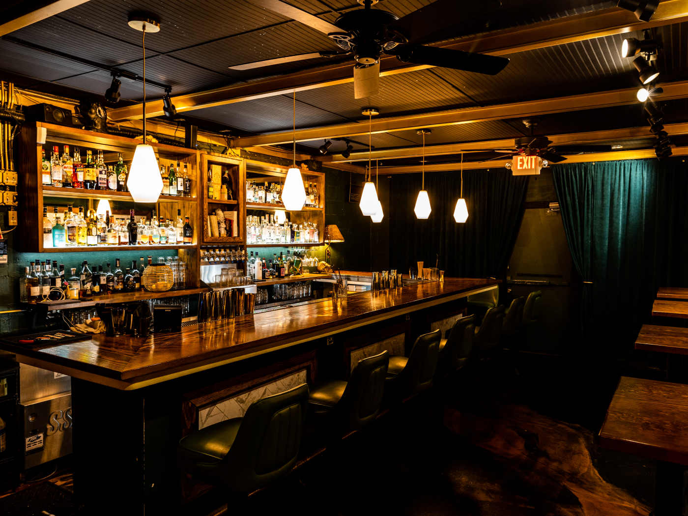
Vault-like speakeasy with daily happy hour and unique pairings

Vault-like speakeasy with daily happy hour and unique pairings
"Located behind Shangri-La on East Sixth, The Treasury is a semi-secret, loosely bank-themed bar. And by loosely bank-themed, we mean that it’s located in a tiny room down a flight of stairs that makes us feel like we’re entering an old vault. There are no reservations, so plan accordingly—weekends can get busy—but they’re one of the few speakeasies in town that offers Happy Hour every day from 6-8pm, in case you needed another reason to kick the night off early. They don’t have food of their own, but you can bring down some White Castle-inspired burgers from the Golden Castle food trailer upstairs, and enjoy a fun, unconventional pairing with a couple espresso martinis. " - nicolai mccrary
Barbara M.
Paul S.
Nancy W.
Joel Alexandre S.
